Overview
Restructuring a large public website around the few things users most needed to accomplish
Client η operated an enterprise-scale insurance website with more than 500 public-facing pages spanning insurance, banking, investments, claims, account services, and support content. The site had grown into a deep digital ecosystem, but its navigation still reflected the accumulated organizational structure more than the limited set of goals users actually brought to the experience.
I led the taxonomy, ontology, and global-navigation work as senior UX architect. The effort began with a comprehensive audit of URL paths, page hierarchy, traffic patterns, user-testing findings, and navigational depth. It ultimately produced a new top-level structure, interactive navigation panels, revised content groupings, and a phased redesign that synchronized navigation changes with matching page and template releases.
Role + Context
Leading the analysis behind the visible navigation
The project began as a site audit in preparation for a public-facing content overhaul. I led a cross-functional team of content specialists, designers, and junior UX architects, partnering closely with a senior content strategist and drawing on data supplied by SEO, analytics, and user-testing teams.
This was never only a header redesign. The visible navigation was the final expression of a much deeper architecture effort: determining what content existed, how it was grouped, where it sat in the hierarchy, how deep users had to travel, and which paths were most important to preserve or simplify.
My responsibilities
- Led the public-site taxonomy and ontology audit
- Directed URL-path sorting, grouping, and hierarchy analysis
- Partnered with content strategy on ontology tools and content models
- Translated traffic and testing findings into UX architecture decisions
- Developed use cases, journey maps, and global-navigation recommendations
- Presented the navigation strategy and phased rollout plan to stakeholders
The Problem
A large content system was asking users to understand the organization before they could complete a task
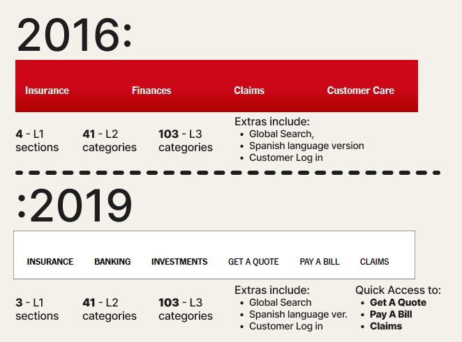
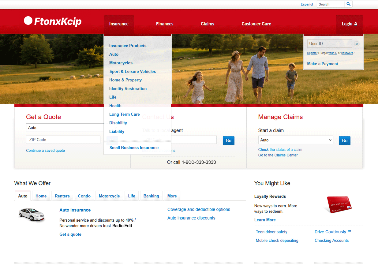
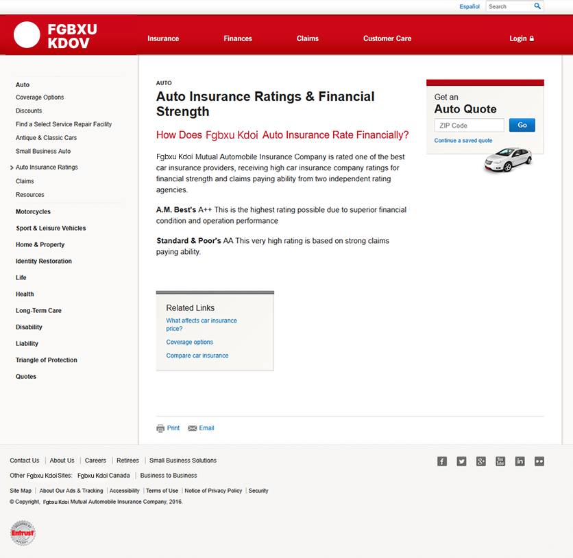
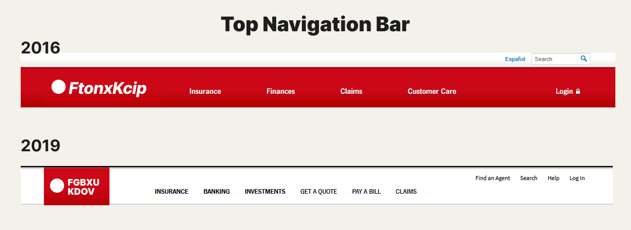
The existing global navigation consisted of four broad buckets: Insurance, Finances, Claims, and Customer Care. Each dropdown exposed links to section hubs and category pages. Once users moved deeper, left-column navigation revealed sibling links and additional sublevels. In some parts of the site, these vertical paths extended four or five levels beyond the global navigation.
Analytics and user testing showed that this structure was not reliably supporting user intent. Nearly 42% of non-customer visits ended after a single page. Of those who did follow a menu link, approximately 34% dropped off there and another 22% after the next click. Fewer than half of non-customer visits began on the homepage, meaning many people entered through search results and depended on interior-page navigation to recover context.
Single-page exits
Nearly two in five non-customer visits ended without a second page view.
Path continuation loss
Additional drop-off occurred after the first menu choice and the next downstream click.
Homepage entry
Most non-customer visits did not begin on the homepage, increasing dependence on resilient interior navigation.
Testing theme
Almost half of relevant feedback focused on finding or accomplishing tasks more quickly.
Research + Evidence
Making the site’s hidden structure visible enough to redesign it
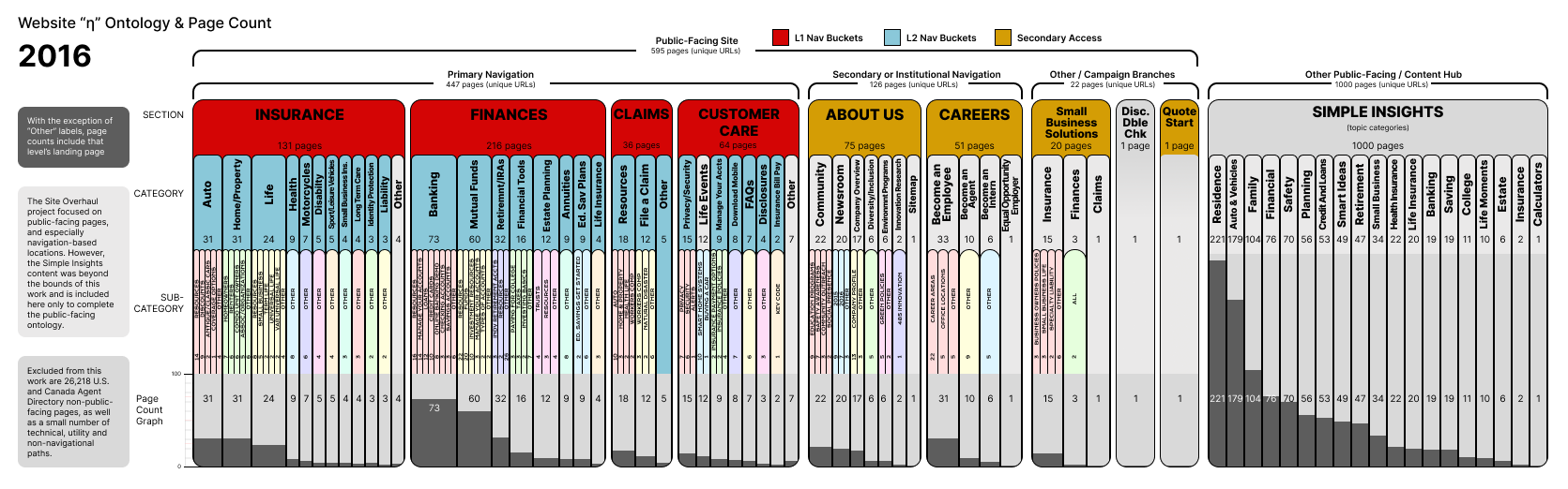
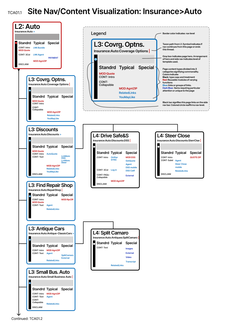
One of the first major tools we created was a visual ontology of the public-facing website. It grouped content by business and navigational primacy, showed the hierarchy beneath each major section, and visualized relative weighting through page counts. The resulting maps gave the team a shared picture of where content was concentrated, where labels overlapped, and where structural depth was creating friction.
A second family of diagrams examined navigational depth and representative page anatomy. These helped us compare how navigation, help, home access, supporting libraries, and enterprise-critical actions behaved at different levels of the experience.
Key Insight
An enterprise-sized website was serving only a handful of dominant user intentions
The most important insight was the mismatch between site complexity and user intent. Despite the size of the website, most visitors were trying to do one of only a few things: explore a product line, get a quote, pay a bill, or check or file a claim.
This changed the design problem. Rather than asking how to expose more of the existing structure, we asked how the global navigation could separate product exploration from immediate action. That distinction became the organizing principle for the redesign.
Design principle: Product categories should explain what the organization offers. Action links should let users do the most common things immediately.
Taxonomy Approach
Reducing broad organizational buckets while preserving legal and business distinctions
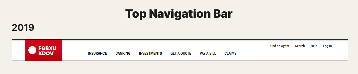
The original structure used four broad sections, but the research suggested that the public-facing experience could be simplified into fewer product-oriented groups plus direct task access. The first working model used two major product buckets, but legal requirements required banking and investment products to remain separate.
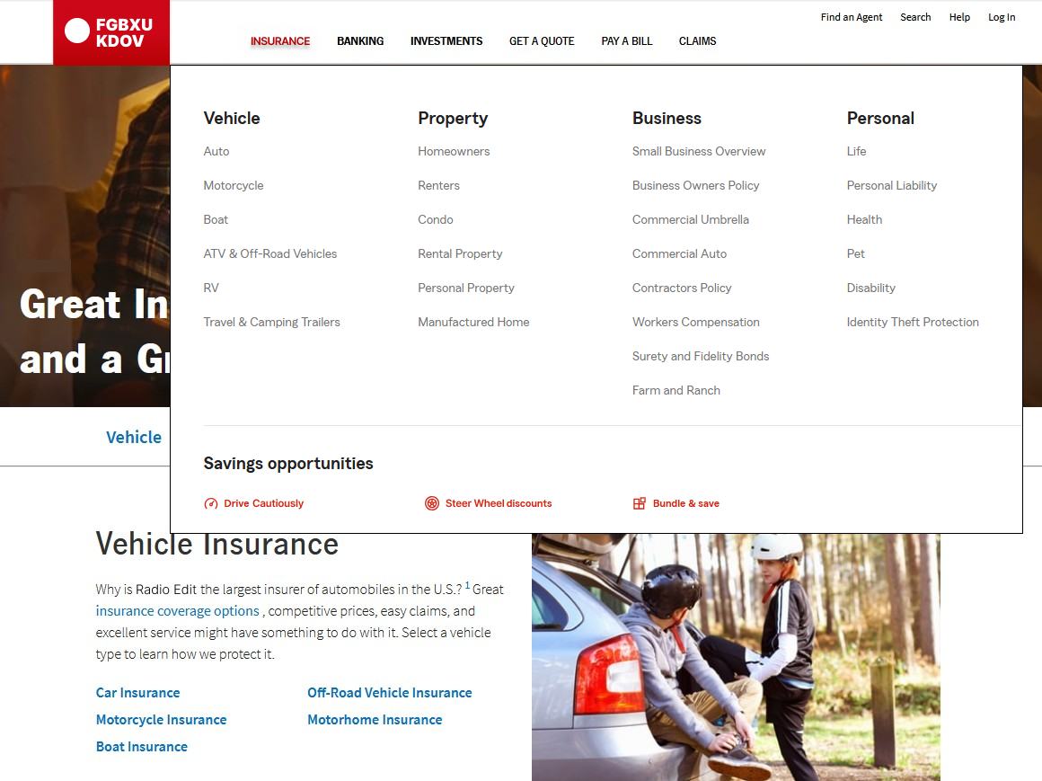
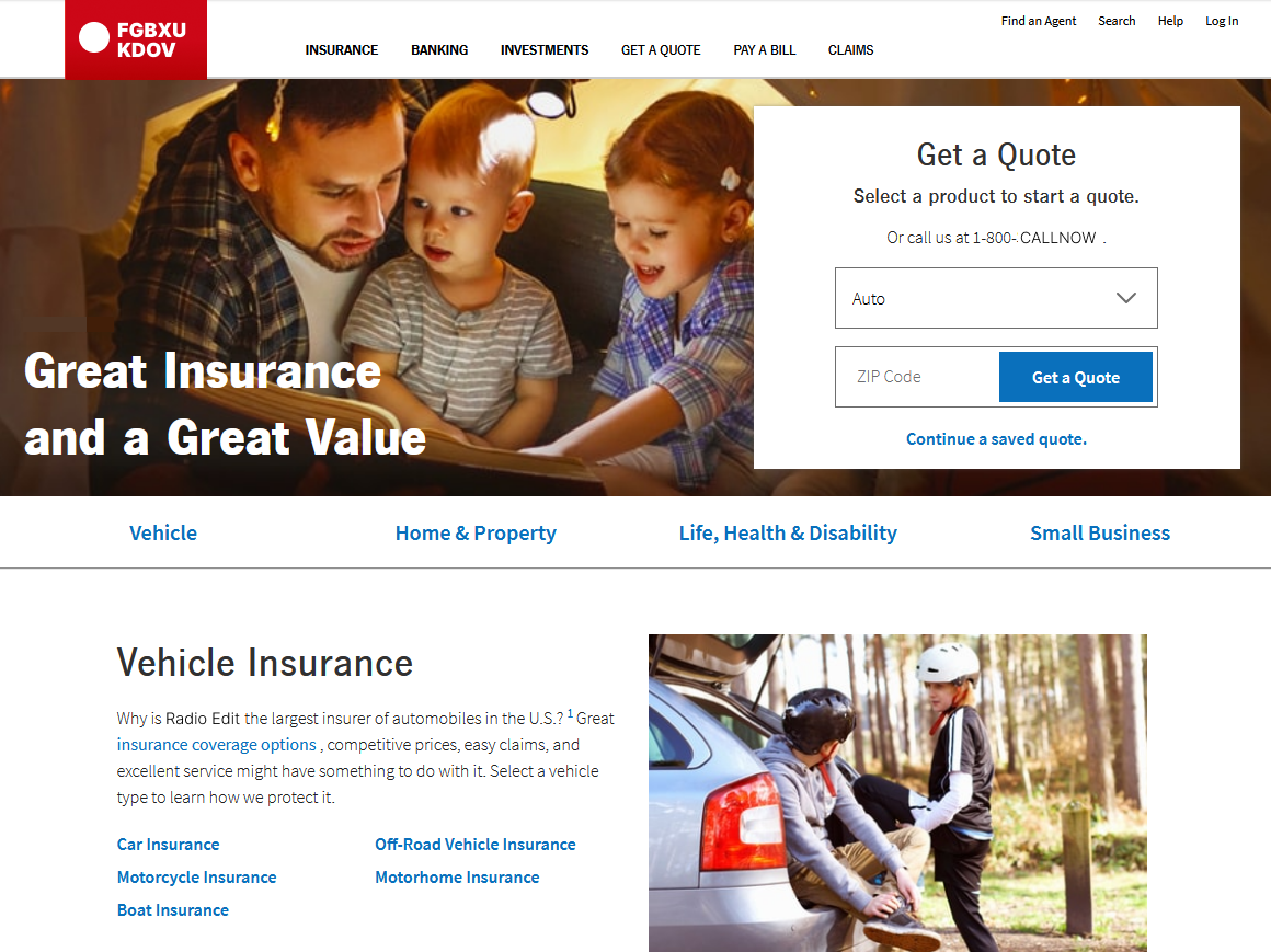
The revised structure therefore used three product-line buckets—Insurance, Banking, and Investments—followed by three direct action links: Get a Quote, Pay a Bill, and Claims. A smaller utility layer supported Find an Agent, Search, Help, and customer login.

Navigation Strategy
Separating product discovery from immediate action
The new global navigation paired the three product-line buckets with the three most important task links. This gave the header a clearer semantic structure: product categories for exploration, action links for high-frequency goals, and a smaller utility layer for global site functions.
Interaction design followed. Instead of narrow dropdown lists, product categories opened into wider interactive panels that could expose more of the relevant category structure at once. This created room for clearer grouping, reduced dependence on intermediate hub pages, and made the relationship between top-level and second-level content more visible.
Phased Rollout
Synchronizing navigation changes with the content and template system beneath them
Initial top-level pages and the first navigation phase were released in approximately six weeks. The broader effort continued through milestone releases over roughly 20 months. Each phase synchronized portions of the new navigation with corresponding taxonomy changes, page-template redesigns, relabeling, and content migration.
This sequencing mattered because the navigation could not get too far ahead of the content it represented. Each release had to preserve working paths while progressively replacing the older hierarchy with the revised system.
Ontology maps
Visualized content hierarchy, page counts, navigational depth, and category weight.
Journey and use-case models
Connected traffic and testing findings to the goals users were trying to accomplish.
Navigation wires and comps
Defined the revised header, utility layer, product panels, and responsive behavior.
Content-template redesigns
Aligned page hierarchy, labels, and navigation behavior with the new taxonomy.
Outcome
A simpler global model supported by deeper architecture work
After the MVP phase, single-page drop-off decreased by approximately 22% from the earlier baseline. Following the final release phase, the reduction reached roughly 40%. Subsequent user testing also found that complaints about finding or accomplishing desired tasks had fallen to almost one-third of the original level.
The more durable result was structural. The project replaced a navigation model centered on broad organizational buckets with one based on product discovery, high-frequency tasks, and a clearer utility layer. Several years later, the underlying content and navigation models were still being used and refined.

What This Demonstrates
Enterprise navigation is a systems problem, not a menu-design problem
This work demonstrates senior UX architecture across a large digital ecosystem: transforming URL inventories and behavioral signals into ontology tools, using those tools to redesign the taxonomy, converting the taxonomy into a global-navigation model, and coordinating rollout with matching content and template changes.
It also shows the enterprise UX foundation behind my AI-focused work: information architecture, evidence synthesis, structural modeling, cross-functional leadership, stakeholder alignment, and phased implementation at scale.